Color Psychology in Hockey: What the Shades Mean for Players and Fans
Ever wonder why a team’s jersey can pump you up before a match? It’s not magic – it’s color psychology. The hues on a kit can change how a player feels, how opponents react, and how fans cheer. In this guide we break down the biggest color effects and give you easy ways to use them on the ice.
Red: Energy, Aggression, and the Drive to Win
Red is the most common power color in sport. It spikes adrenaline, makes you feel more aggressive and ready to attack. Studies show teams wearing red score slightly more goals because the color triggers a ‘fight‑or‑flight’ response in both the wearer and the opponent. If you’re looking to boost offensive confidence, a bold red strip or red sleeves can do the trick.
Blue: Calm, Focus, and Defensive Strength
Blue does the opposite of red. It lowers heart rate and helps players stay calm under pressure. Defensive units that wear navy or royal blue often report better concentration during tight games. Adding a splash of blue to a locker‑room wall or a practice jersey can keep the squad steady when the game gets intense.
What about black? The color gives a sense of intimidation and unity. Many successful NHL teams use black accents to appear tougher. Yellow and orange bring optimism and quick reflexes – perfect for wingers who need fast reactions.
Fans aren’t immune to these effects. A crowd in a sea of a team’s primary color creates a home‑ice advantage that can sway referees and boost player morale. Clubs often sell merchandise in the dominant hue to amplify this visual support.
So, how can you apply color psychology right now?
1. Pick a primary color that matches your goal. Want more aggression? Go red. Need calm? Choose blue.
2. Use accent colors for specific roles. Add orange strips to forward jerseys for speed, or black cuffs for defensemen to signal toughness.
3. Involve fans. Encourage supporters to wear the team color on game day – a coordinated crowd looks powerful and can push players to perform better.
Don’t overdo it. Too many bright colors can distract and confuse. Stick to one main shade and one or two accents. Keep the design clean so players can focus on the game, not the pattern.
Finally, test it out. Change a practice jersey color for a week and record any shift in player energy or stats. Small adjustments can lead to noticeable gains over a season.
Color psychology isn’t a silver bullet, but it’s a low‑cost, high‑impact tool for any hockey team looking to up its game. Try it, watch the reaction, and let the colors work for you.
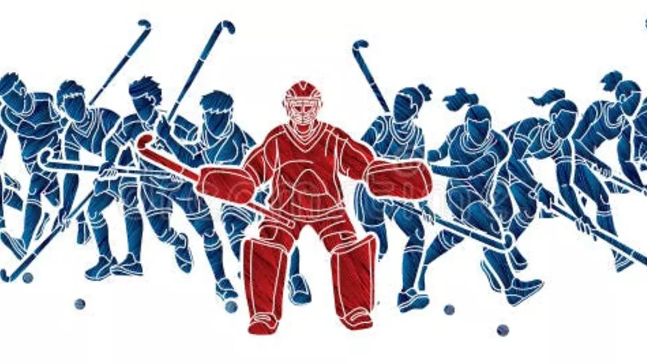
Why are some hockey pitches blue?
Hey there, puck lovers! Ever wondered why some hockey pitches are as blue as your grandma's favorite knitting yarn? Well, there's actually a method to the madness. These blue pitches add a pop of color, sure, but they also help the bright yellow ball to stand out better, making it easier for players to track its movements. So, next time you're watching a game, you can impress your buddies with this fun fact. Just like a peacock in a field of pigeons, that yellow ball is easier to spot on a blue pitch!
View MorePopular Posts