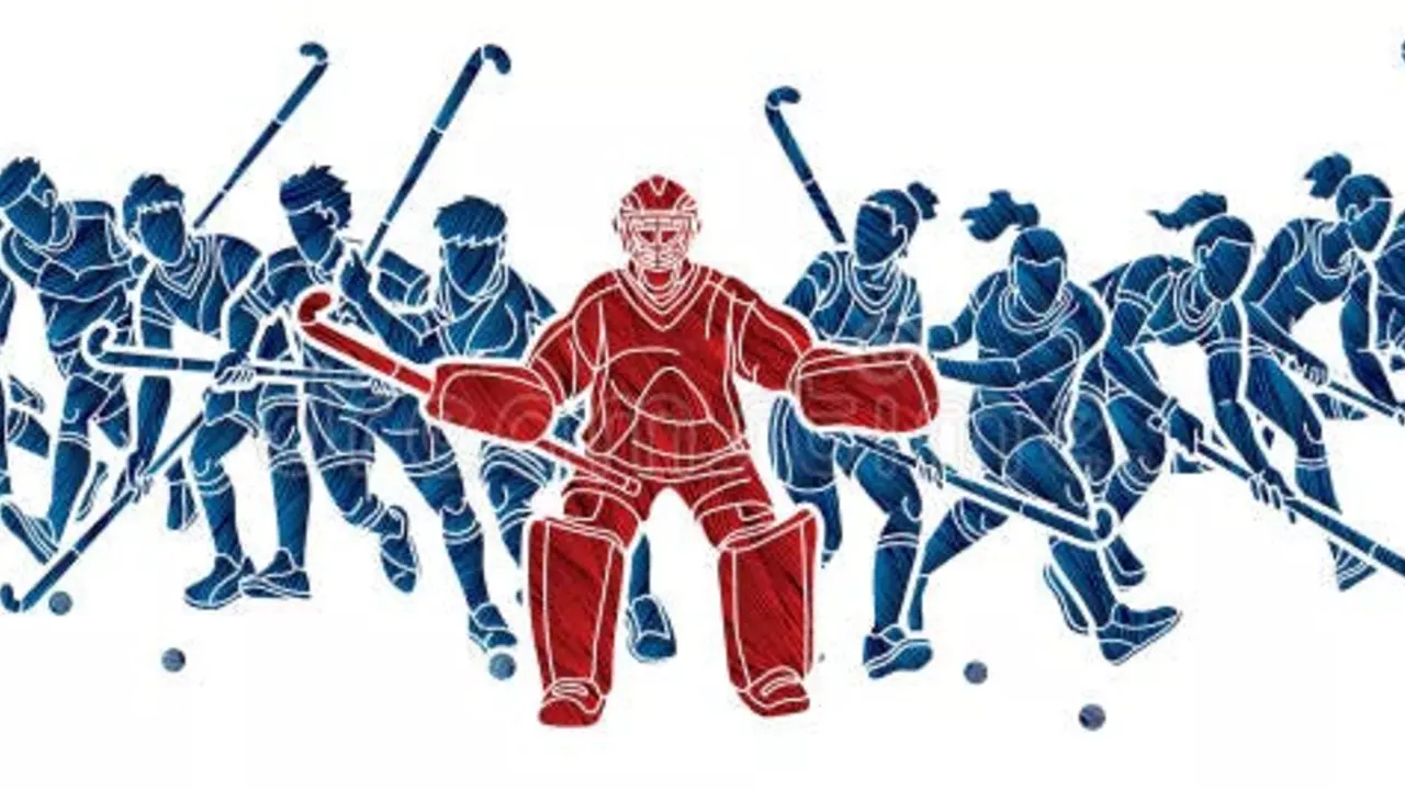
Blue Color – Meaning, Uses and How It Impacts Hockey Fans
When you see a splash of blue on the rink, you instantly think of calm, confidence, and team spirit. Blue isn’t just a pretty shade; it’s a signal that tells opponents you’re cool under pressure and ready to push forward. In this guide we’ll break down what blue means, why it’s a go‑to for hockey teams, and how you can use it in your own designs.
Psychologically, blue triggers a sense of stability and focus. Studies show that people exposed to blue perform better on tasks that require concentration. That’s why locker rooms often have blue lighting – it helps players stay sharp. The color also lowers heart rate a bit, which can keep nerves in check during a tight game.
Culturally, blue carries a lot of weight. In the UK it’s linked to royalty and tradition, while in North America many clubs adopt it to reflect their city’s flag or local heritage. The colour can also hint at trustworthiness, so fans feel a stronger bond with a team that wears it proudly.
In sports, blue is a practical choice. It contrasts well against the white ice and bright red or yellow accents, making player numbers easy to read from the stands. Teams like the Toronto Maple Leafs (blue and white) and the New York Rangers (red, white, blue) have built iconic looks that are instantly recognizable.
Why Blue Works in Hockey Jerseys
First off, visibility matters. On a fast‑moving rink, a deep navy or sky‑blue stripe can be spotted from across the arena, helping referees and broadcasters keep track of who’s who. Second, blue pairs nicely with almost any secondary colour – you can add a pop of orange for energy or a dash of white for a classic look. Finally, the shade you pick can affect how players feel. A brighter blue may pump up youthful energy, while a darker hue can give seasoned veterans a more serious vibe.Fans also love the story behind the colour. When a club adopts a specific blue linked to a city’s history, supporters feel a sense of pride wearing the same shade on their scarves or T‑shirts.
Tips to Use Blue in Your Own Designs
Start with a base colour that matches the mood you want. If you’re aiming for calm and professional, go for navy or steel blue. For a fresh, lively feel, choose a lighter sky or electric blue. Pair it with a high‑contrast colour for text or numbers – white, yellow, or orange work best.
Keep balance in mind. Too much blue can feel cold, so add a warm accent like a red logo or a gold outline. Use different textures – matte fabric for the main body and glossy embroidery for the logo – to give the design depth.
Test the jersey under arena lighting. Blue can shift hue under bright lights, so check that the numbers stay legible. If you’re designing fan merch, think about how the colour looks on both dark and light backgrounds to keep the look consistent.
Finally, stay true to the story. Whether you’re honoring a city’s flag or just love the colour, weave a short narrative into the design brief. Fans love a shirt that tells a story as much as they love the colour itself.
Why are some hockey pitches blue?
Hey there, puck lovers! Ever wondered why some hockey pitches are as blue as your grandma's favorite knitting yarn? Well, there's actually a method to the madness. These blue pitches add a pop of color, sure, but they also help the bright yellow ball to stand out better, making it easier for players to track its movements. So, next time you're watching a game, you can impress your buddies with this fun fact. Just like a peacock in a field of pigeons, that yellow ball is easier to spot on a blue pitch!
View MorePopular Posts


Is 20 too late to start learning ice hockey?
Feb, 5 2023